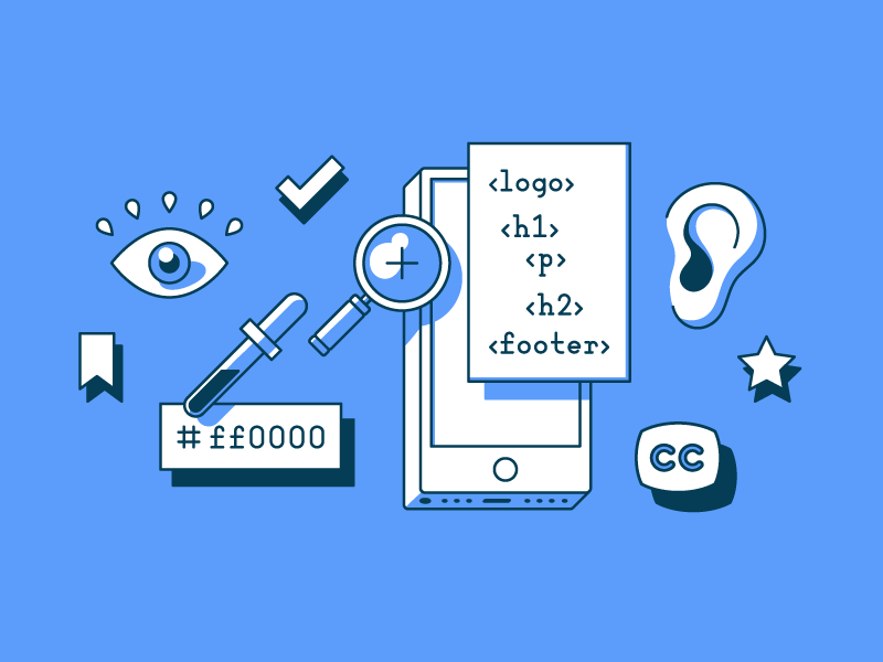
Accessibility on the web is too often treated as an afterthought. It’s framed as something to be checked off at the end of a sprint, tested with automated tools, and then forgotten once a Lighthouse score hits 90+. But accessibility is not about compliance. It’s about people.
Millions of users rely on assistive technologies every day. Some are blind or have low vision. Others navigate entirely via keyboard, use voice control software, or experience cognitive challenges that make interacting with complex UIs overwhelming.
If you’re building modern web applications, especially with frameworks like React and Next.js, it’s time to go beyond the basics. In this article, we’ll explore how to implement real, meaningful accessibility across architecture, interactivity, and context. Not just because it’s the right thing to do, but because it creates better products for everyone.
1. Semantic Structure: The Invisible Foundation
Semantic HTML is the backbone of accessible web experiences. Screen readers don’t care what your site looks like. They interpret what your code says.
Too many developers still fall into the habit of div-wrapping everything and throwing ARIA attributes on top. This creates unnecessary complexity and often introduces bugs for assistive tech users.
✅ Practical Tips:
- Use
<main>,<article>,<section>, and<aside>to define regions of a page. - Ensure you only use one
<h1>per page to define the main heading. Then cascade down (<h2>,<h3>, etc.) according to content hierarchy, not visual size. - Avoid “div soup.” If there’s a native HTML element that fits, use it. Need a button? Use
<button>. Need navigation? Use<nav>.
Pro tip: Tools like HTML5 Outliner can help you visualize the actual structure of your HTML and identify missing semantics.
2. Keyboard Navigation: Default and Custom Support
Not everyone uses a mouse or touchscreen. For some, the keyboard is the only way they can interact with the web. That’s why every interactive element must be keyboard-accessible.
In React and Next.js applications, where interactivity is often customized, it’s easy to break native behavior. Dialogs, dropdowns, modals, and carousels often fail when tab order, focus management, and ARIA roles are neglected.
🔧 Implementation Checklist:
- All interactive elements (buttons, inputs, links) must be reachable via the Tab key.
- Custom components must support Enter and Space for activation.
For modals:
- Set
focus()to the modal when it opens. - Trap focus inside the modal while it’s active.
- Restore focus to the triggering element when it closes.
🧠 ARIA Matters:
aria-expandedfor toggleable elementsaria-controlsto associate controls with contentaria-haspopupfor dropdowns or popoversrole="dialog"andaria-modal="true"for modals
3. Forms That Actually Communicate
Forms are where most accessibility issues arise, and where they matter the most. Users need to know what to fill out, what went wrong, and how to fix it, without guessing or relying on visuals alone.
🔍 Beyond Labels:
- Use
aria-describedbyto connect inputs with helper text, validation messages, or instructions. - Provide real-time validation, but avoid aggressive alerting that interrupts screen readers.
- Pair visual cues (like red borders or icons) with text explanations. Don’t rely on color alone to indicate errors.
Example: Instead of just highlighting a field red, include text like “Email is required” and associate it with the input via aria-describedby.
💡 Use the Right Libraries:
React form libraries like react-hook-form and Formik can help scale accessible practices. Look for plugins or extensions that support automatic ARIA and validation states.
4. Dynamic Content and Live Announcements
In modern SPAs, content often changes without a full page reload. For screen reader users, this can be disorienting if changes aren’t explicitly announced.
React and Next.js apps need to be intentional about communicating DOM changes.
📣 Use Live Regions:
- Wrap notification elements in a container with
aria-live="polite"(orassertivefor urgent updates). - Update that region’s content when actions occur, like “Item added to cart” or “Message sent.”
<div aria-live="polite" role="status">{message}</div>
🔄 Handle Route Changes:
Next.js doesn’t trigger full page reloads, so screen readers may not realize the page changed.
Use useEffect() to track route changes via router.pathname and update a hidden heading or live region accordingly.
const router = useRouter();
useEffect(() => {
  announce(`Page changed to ${document.title}`);
}, [router.pathname]);
5. Don’t Depend on Color
Design systems often lean heavily on color to convey meaning. Green for success. Red for errors. Gray for disabled states. But this leaves out users with color blindness or low vision.
🧠 Accessibility Strategy:
- Always combine color with text, icons, or patterns.
- Use recognizable symbols (like checkmarks, warning triangles, or exclamation icons).
- Ensure adequate contrast:
- AA: 4.5:1 for normal text, 3:1 for large text
- AAA: 7:1 for normal text
Use tools like WebAIM Contrast Checker to validate your design colors.
6. Real-World Testing (Not Just Automated Tools)
Automated tools are useful but limited. They catch about 30 to 40 percent of accessibility issues. The rest must be found through manual testing.
🔍 Essential Tools:
Screen Readers:
- Windows: NVDA (free), JAWS
- macOS/iOS: VoiceOver (built-in)
- Android: TalkBack
Keyboard Testing:
- Try using your app without touching your mouse. If you can’t navigate fully, neither can others.
Browser Extensions:
- Axe DevTools
- WAVE Evaluation Tool
✅ Integrate Testing into CI/CD:
Tools like Cypress with axe-core allow automated accessibility regression testing during your builds.
7. Accessibility Is a Shared Responsibility
One of the biggest myths about accessibility is that it’s a “frontend problem.” In reality, it’s everyone’s job.
Who should care:
- Designers should avoid inaccessible color schemes and ensure sufficient spacing and labels.
- Developers should use semantic HTML, manage state thoughtfully, and implement focus control.
- QA teams should include accessibility testing in their workflows.
- Product owners should prioritize inclusive experiences, not just features.
Accessibility isn’t something you add later. It’s something you build from the start.
Conclusion: Build with Everyone in Mind
Accessibility is not a feature. It’s a foundation. It’s not just about compliance. It’s about care.
When we design and code with inclusion in mind, we don’t just serve users with disabilities. We create products that are more usable, resilient, and respectful for everyone.
The best time to make your application accessible was yesterday. The second-best time is today.